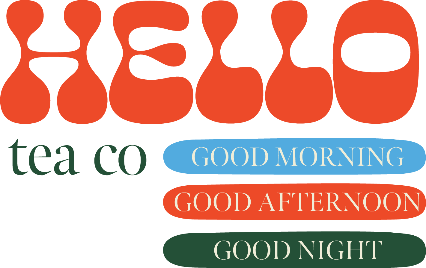
Hello Tea Co
Brand Design
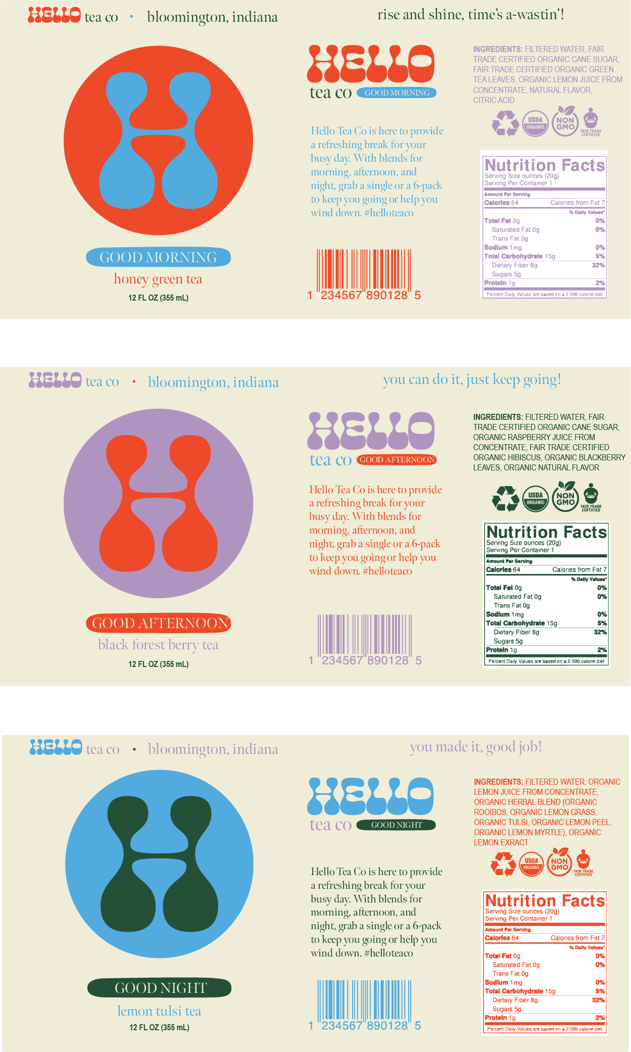
Packaging Design
PROJECT DETAILS:
Hello Tea Co is a concept brand for a functional, ready-to-drink tea beverage.


Creative Justification + Brand Summary
Brand Values
Fun, Convenient, and Trustworthy
Brand Personality
The personality of this brand is youthful, vibrant, and exciting, with a modern, stylish edge.
Target Audience
The target audience is busy students and working millennials who are looking for a trustworthy brand they can easily grab and go throughout their busy day. They may also be attracted to a brand with slick, eye-catching packaging that would complement their Instagram feed.
Creative Justification
I chose the typeface for the logo design because I thought it captured the youthful, near-psychedelic type trend that I see in brands of late. My goal was to create a logo that resonates with hip, young working professionals and students. The names of the different blends, “good morning”, “good afternoon”, and “good night”, are purposefully chosen as greetings to match the brand name, “Hello”. This is to complement the conversational nature of the brand. The tea is your buddy, providing support as you go through your day. The color palette is bright, with complementary blues and oranges highlighted. I wanted to create a brand with youthful, vibrant colors to match the personality. It’s energetic, almost serving to give the consumer a boost just by holding the can.