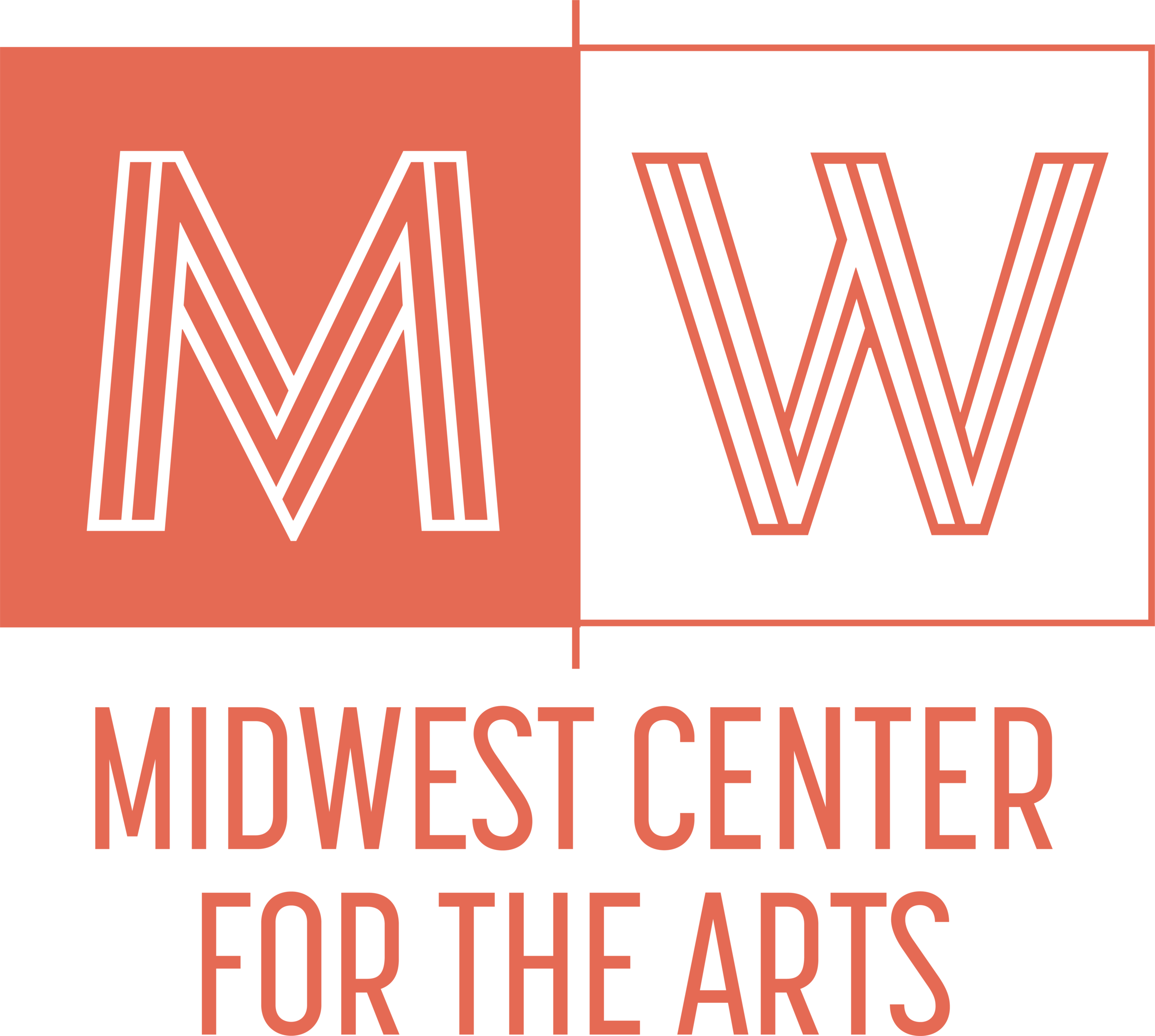
Midwest Center for the Arts
Brand Design
Brand Collateral
Production Design
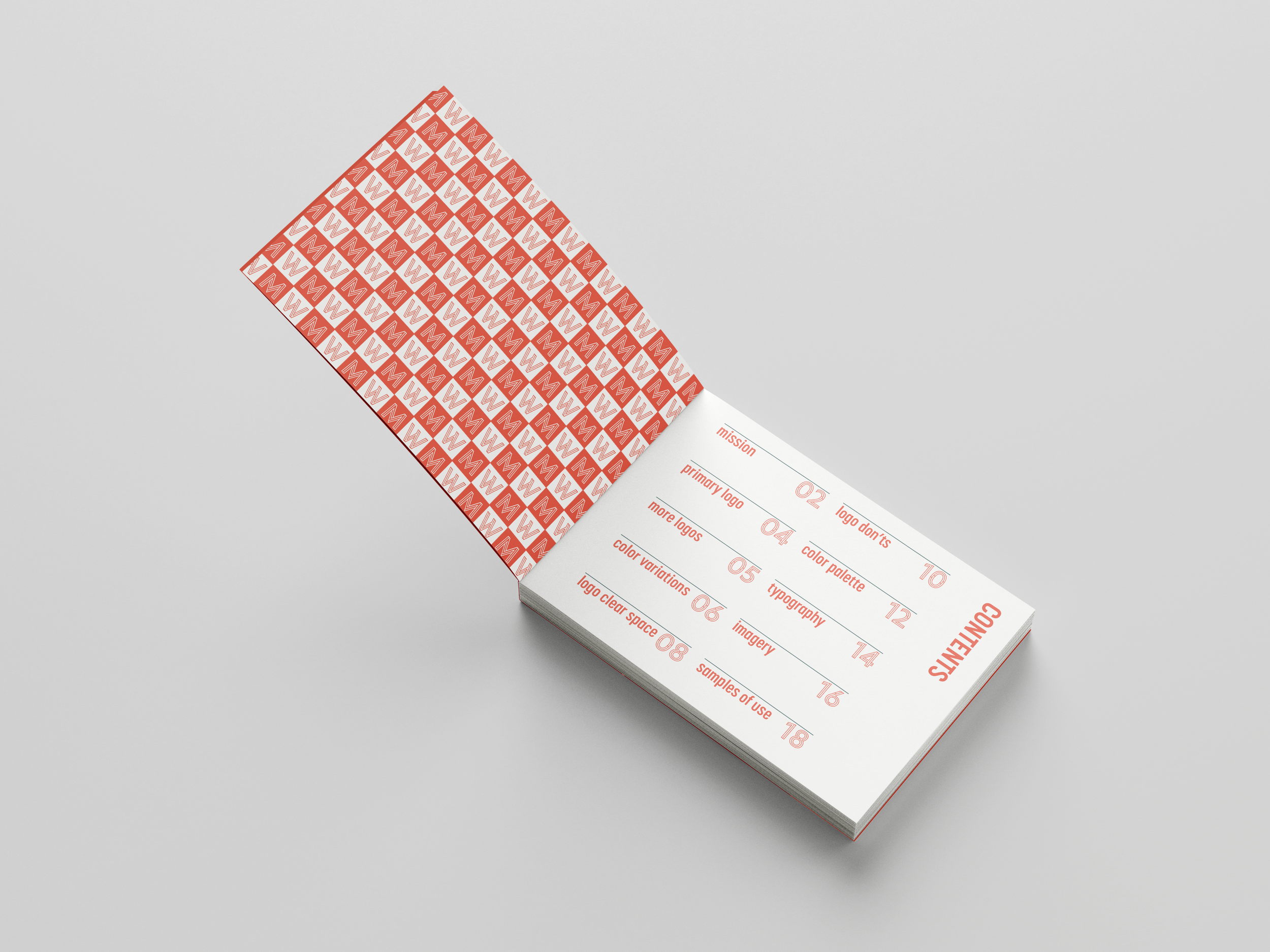
PROJECT DETAILS
Midwest Center for the Arts was founded in 1950 and is located in beautiful northwest Michigan. Each year, thousands of artists and arts patrons come to Midwest Center for the Arts to experience world-class educational and cultural opportunities. I was tasked with designing a new brand identity for the center, along with a full brand standards guide, a promotional poster, and examples of brand use.


Creative Justification + Brand Summary
Overall Visual Style
The overarching visual style for the MWCA brand is smart, modern, institutional, and timeless. The strong lines, symmetry, and 90-degree angles, and balance of the logo mark work to connote the stability and trustworthiness of the center. This mark ensures that the identity is associated with a community institution that is dedicated to increasing community art literacy and access. The mark is minimal and subtle, allowing the themed content and communities to shine through and take center stage.
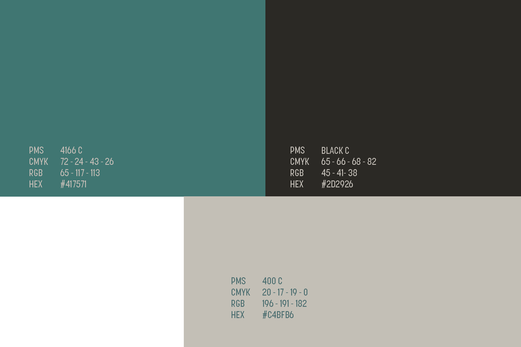
Color Choices
While the design of the logo mark is about stability and dependability, these themes on their own could be seen as stodgy or too serious. The MWCA is also a warm place full of smiling faces, fun, and learning for all ages. For this reason, a more vibrant, soft primary color has been chosen. The color is a balance between stark primary red and a feminine pink, striking the right balance to communicate that this institution is serious and here for the long-haul but also ready to play. The secondary colors are minimal, again, to allow the thematic content, events, and bright shining faces to take priority. These unconventional colors also serve to help MWCA stand out as the unique center that it is.
Typography
As the overall style for the brand is minimal in nature, the typography is chosen to match. The Korolev Condensed family of fonts works to echo the sentiment of stability, appearing as a tall, steady, set of letterforms that work closely together. This is the only approved font family aside from the primary display font, Ysans Mondrian, which is an unexpected and visually-complicated set of letterforms that speaks to the curiosity and wonder of the center.
Target Audience
As the target audience is really patrons of all ages, this brand identity seeks to appeal to everyone. It is mature and institutional, but there are playful elements, patterns, and colors throughout. Ultimately, the brand identity should be used to emphasize MWCA’s long-standing status as a community institution that is committed to increasing access to the arts.